Here are some drawings from college. Unfortunately, when I graduated and moved, I threw away my old life drawing class pictures, my silkscreen prints and all my paintings... so all that's left are some illustrations from design class and personal works. You'll notice there aren't many from that personal category because I was so focused on graphic design instead.![]()
![]() One of our first class projects. Redesign some box labels that need to read at small sizes and multiple languages.
One of our first class projects. Redesign some box labels that need to read at small sizes and multiple languages. A sketchy looking rec center logo.
 My lovely wife as a super hero. Wanted her legs to look buff, but I made them and her feet too big.
 Hulk v Spidey sketch. Started being heavily influenced by comic artists like Ed McGuinness and Joe Madureira.
 Hulk from 1998.
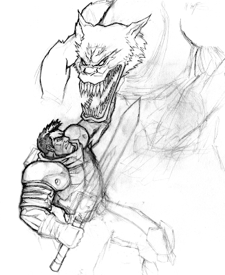
 Made up scene, based on Battlechasers characters.
 My take on Wolverine. I like him depicted with shaggier style hair, instead of being moussed to horns like in most comics. I dropped some quick black on his hair and eyebrows for you because they looked funny without it.
 Inspired by Tsui Hark's Blade (Kung fu movie, not the Snipes one). It's a remake of the One Armed Swordsman.
 Some graffiti looking type for a friend's cd cover.
 Book cover element.
 Elements for a radio station ad.


 Pages from an NRS Press Kit which previewed upcoming products. For some reason I didn't use a ruler or curve template for any of these...
 Asparagus, for an little ad for Tracy's family's restaurant, Golden Star.
 U of I Time Schedule Cover submission. The type sucks, but I had fun with the illustration.
 Close-up of item I snuck in.
There you have it. If I find more I'll post it up. Next up: After college to more current!
February 24, 2007
College Drawings
Posted by
Drake Brodahl (pumml)
at
Saturday, February 24, 2007
![]()
![]()
Subscribe to:
Post Comments (Atom)


1 comment:
Very nice job!! And very nice Wolverine.
Post a Comment